


AceAssist
An AI assistant that understands the full context of a student's academic life.
Timeline
February 2025, 1-month sprint + self-initiated iteration while waiting for Y Combinator
submission results
Company
AceAssist
Role
Sole designer — user research, UI/UX design, prototyping, demo video production and voiceover
Teams
1 founder/engineer (ex-Alibaba, CMU), 1 designer (me), fully remote
Research
7 qualitative interviews recruited via userinterview.com
Outcome
Y-combinator application submitted with full demo video. Core screens redesigned on own initiative while waiting for results. Team sunsetted after Y Combinator rejection.
No tool understands a student's full academic picture.
College students juggle 4–5 disconnected tools: ChatGPT, Quizlet, YouTube, calendar, email. Nothing talks to each other.
Existing AI tools report accuracy as low as 45% — but every student uses them anyway. Adoption isn't the problem. Trust and fragmentation are.
No single tool understands a student's full academic context. That's the gap AceAssist was built to close.

RESEARCH
The real problem was fragmentation, not AI quality.
7 qualitative interviews conducted through userinterviews.com in a week — pre-med, CS, economics, physics, dance/psych, community college, MBA analytics. Diverse enough to find patterns that weren't just one type of student.
INSIGHT 1
Tool fragmentation is universal
Every student used 4+ disconnected tools. No unified environment existed.
INSIGHT 2
Students tolerate broken AI because nothing better exists.
All 7 used ChatGPT despite 45% accuracy. The problem wasn't adoption — it was trust.
INSIGHT 3
Price consensus at $5–10/month.
Unusually consistent across very different student profiles. A real willingness-to-pay signal.
"Interviewing 7 students in a week while racing toward a YC deadline felt reckless. It was the opposite. Without those conversations, we would have built a better ChatGPT wrapper. Instead, we understood the actual problem was fragmentation — not AI quality."

Y Combinator SPRINT & FIRST VERSION
Fast and functional — a conscious tradeoff.
The demo video was produced and voiced entirely by me. The opening line — "juggling all your courses and deadlines" — is the fragmentation insight in plain language.
YC Application Demo Video
"The deadline was hit. But I knew the UI wasn't where it needed to be — and I wasn't willing to leave it there."
Second Version
Iterating further before knowing the outcome
Nobody asked for this — I rebuilt it on my own initiative before knowing the YC result.
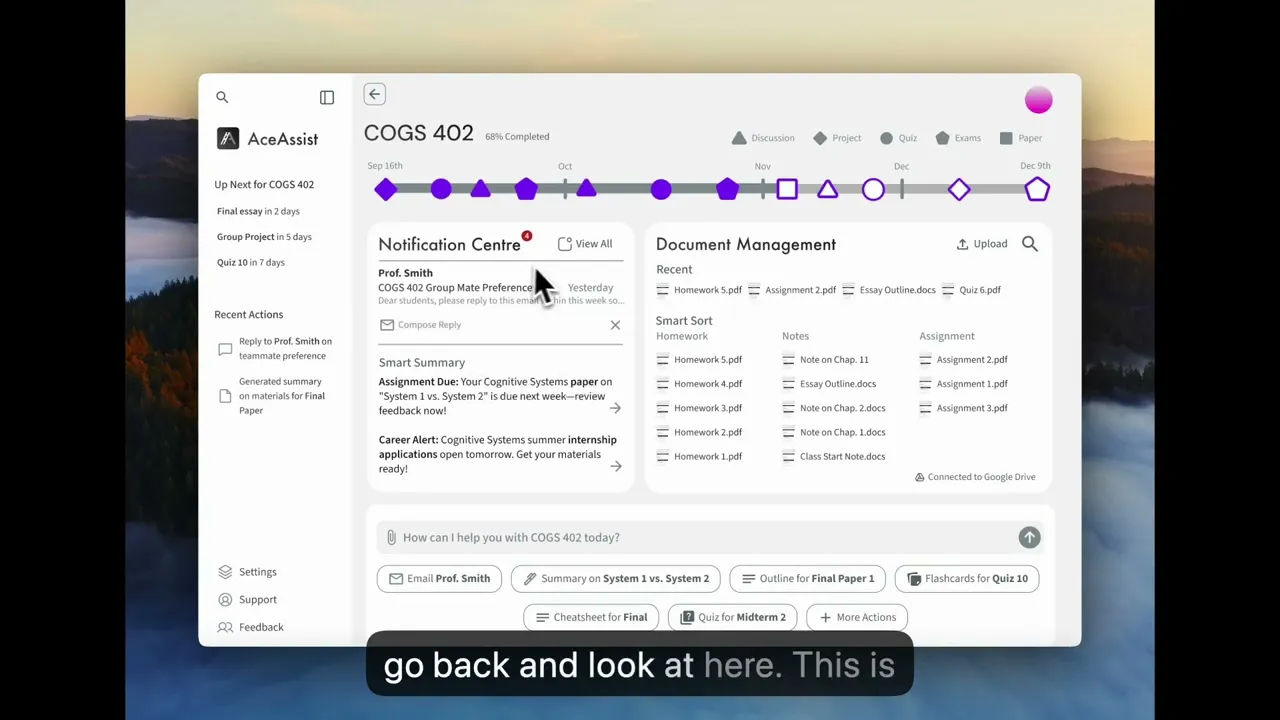
The problem wasn't visual. It was structural. Information was organized by category rather than by user intent.


"The impulse to polish instead of restructure was strong. But the research pointed at a structural problem, and I'd rather ship fewer screens that are architecturally right than more screens that are superficially better."
Reflection
Structure before surface
The first instinct after the sprint was to polish. The research said otherwise — the problem was how information was organized, not how it looked. The Act/Know/Explore taxonomy, the AI prompt bar as hero element, the shift from organizing to surfacing action — none of these are visual changes. They're structural. I carry this forward: when something feels wrong in a design, check the architecture before reaching for the pixel tools.
What's unfinished — honest: Flashcards, summary, and notification detail screens weren't redesigned before the team sunsetted. Only two core screens got the full treatment. The scope I'd prioritize next: notification detail flows first (highest user frequency), then flashcard generation (most directly requested — Ashlyn and Shamar both named it).
What I'd measure if the project continued:
AI query frequency per course — is the contextual prompt bar being used?
Feature adoption rate per action type — which AI actions are trusted, which are ignored?
Week 2 retention — if it drops, investigate whether file-upload onboarding creates too much friction before value is delivered
"Seven interviews in a week isn't textbook methodology — but every design decision I made traces back to something a real student said. Speed and rigour aren't opposites if you know what questions to ask."

